
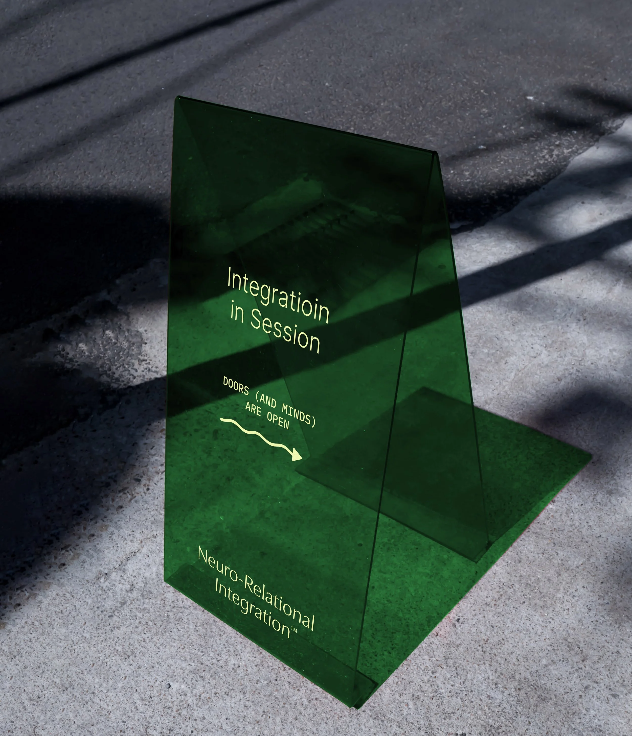
Neuro-Relational Integration
Neuro-Relational Integration (NRI) is a framework that weaves neuroscience, relational practice, and spirituality into tools for leaders, educators, therapists, and spiritual communities. The organization needed a brand identity that could hold the complexity of their work while remaining approachable, flexible, and clear across many contexts.
ADAPTIVE
MEANINGFUL
ORGANIC
CENTERED
TRUSTED


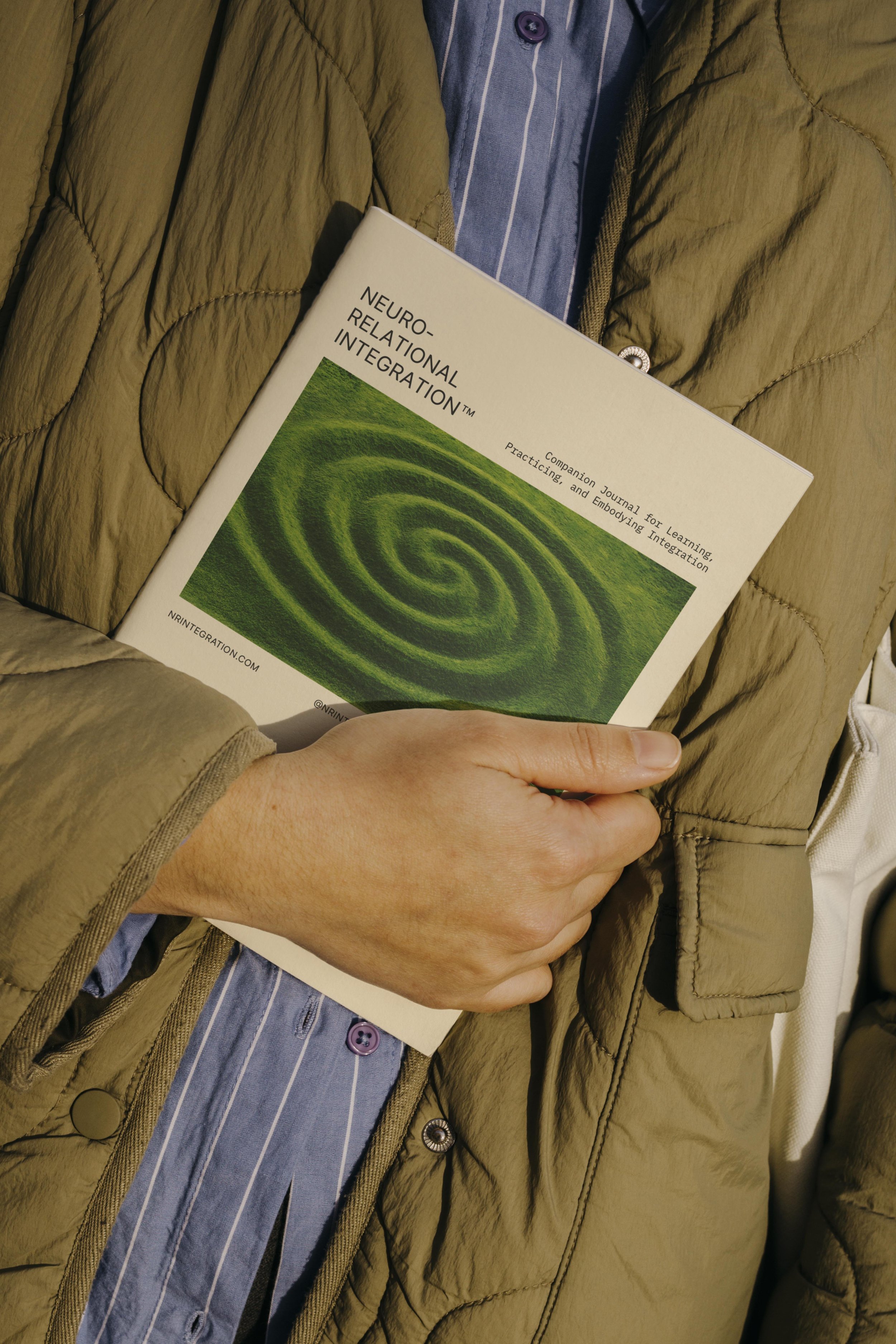
Before working together, NRI had some preliminary branding, but it wasn’t substantial or cohesive enough to be applied consistently across different use cases. My role was to create a complete brand system that reflected their depth and clarity while staying adaptable. This included a suite of wordmarks, an integration-focused icon, a monogram, tagline designs, a rich color palette, typography suite, and art direction for photography which was delivered in a detailed brand guidelines package to ensure the identity could thrive in practice.
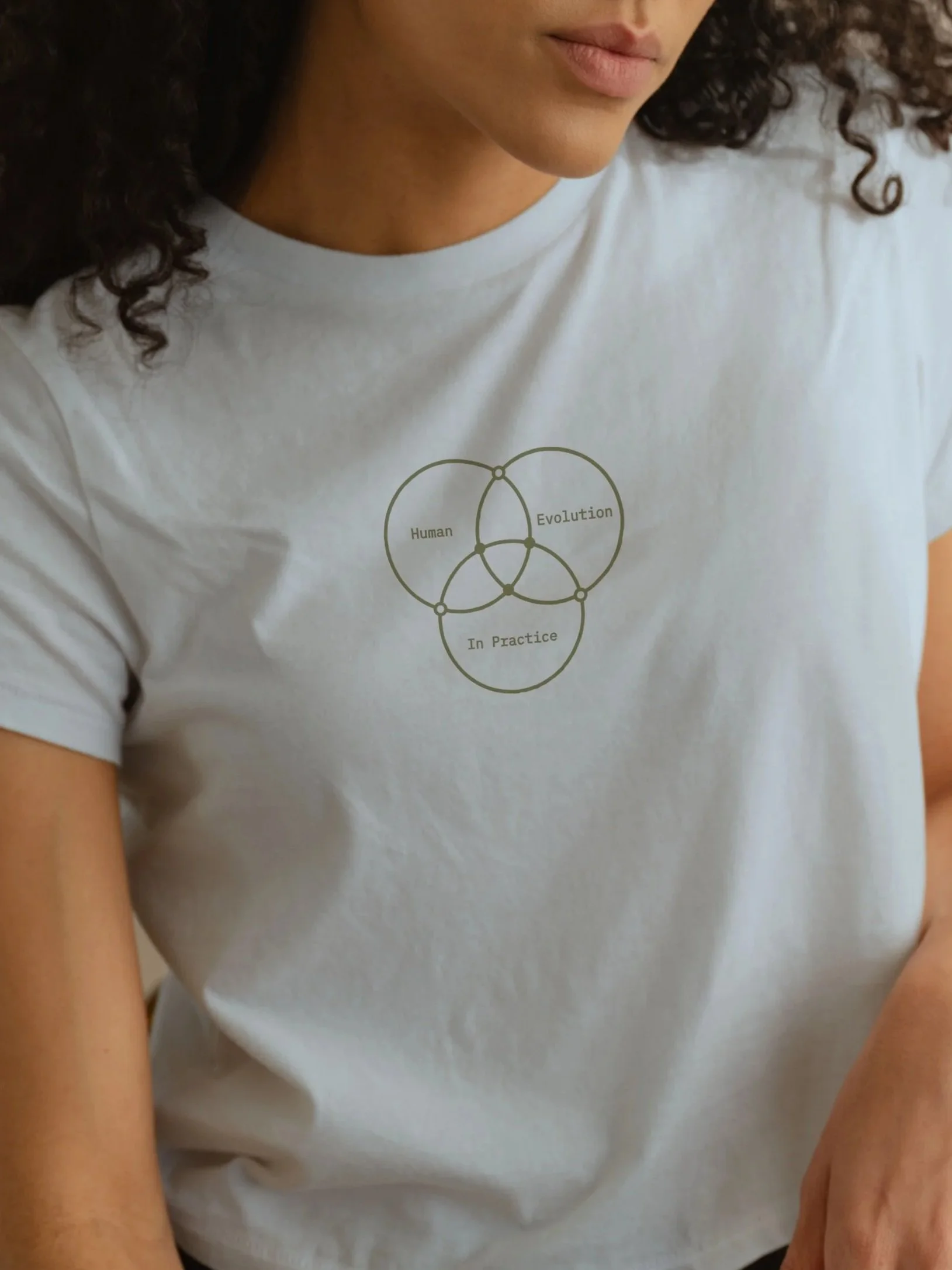
One of the central challenges for NRI was finding a way to visually and verbally express the depth of their work without feeling overly academic or inaccessible. To meet that need, we developed the NRI icon as a living symbol of integration. Three main circles reach toward one another, their first points of overlap marked by open dots — moments of initial contact where connection sparks but isn’t yet whole. As the shapes continue to weave together, the energy builds toward the center, where all aspects overlap. Here, the dots solidify, representing the deepest integration: mind, body, and spirit moving beyond separation into coherence.
This mark is both grounded and expansive. Its continuous lines speak to flow and balance, while its geometry nods to molecular structures and constellations; these are patterns that remind us we are part of systems both intimate and infinite. It’s an icon that captures NRI’s essence: integration as a process of becoming, always unfolding, always alive.
PROJECT OVERVIEW


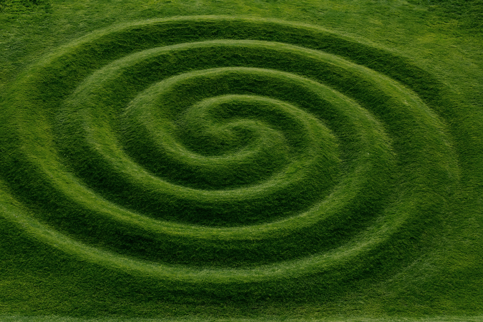
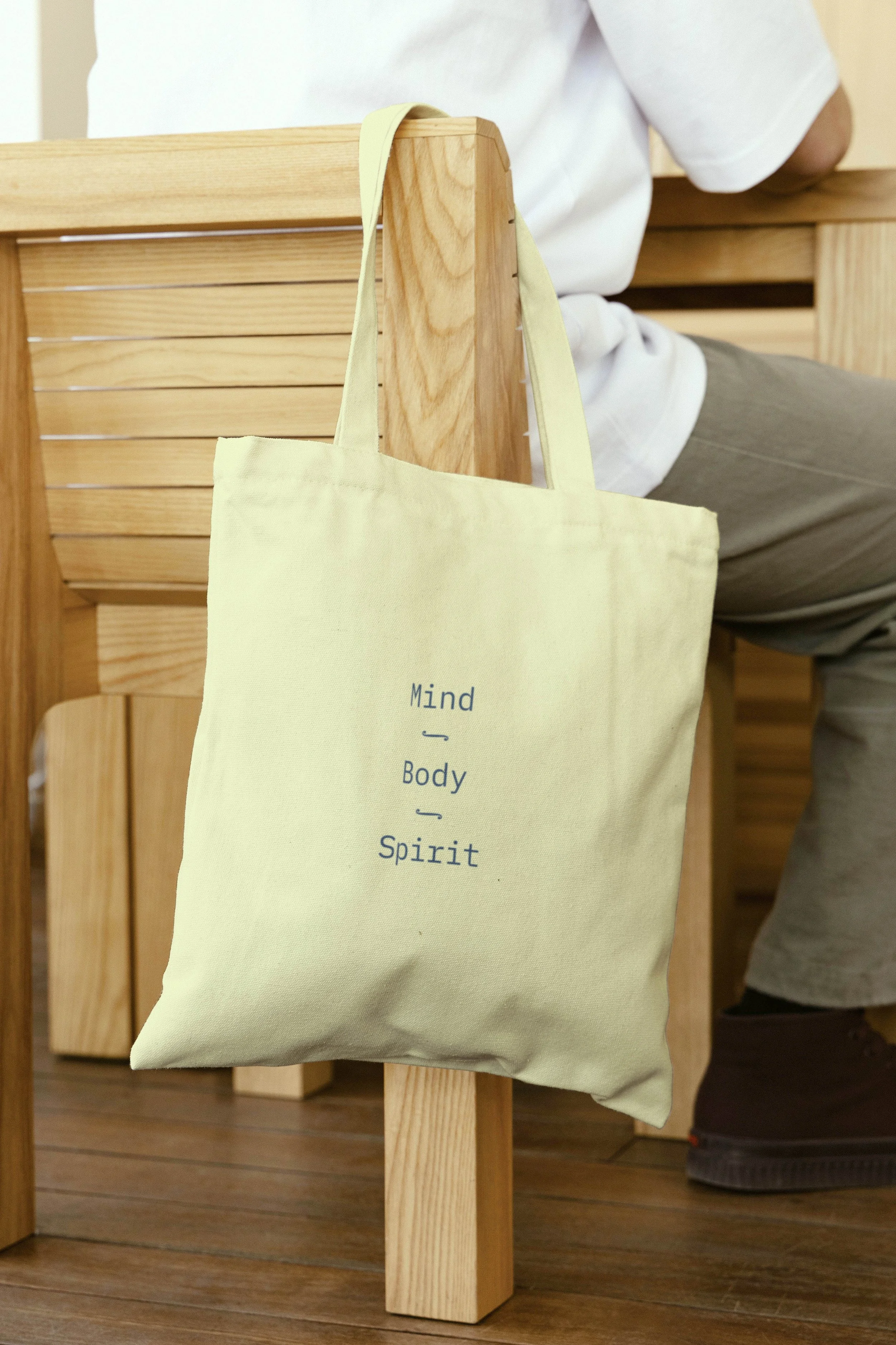
This layered system extends into NRI’s broader visual world, creating a library of imagery and symbolism that is both flexible and resonant. Spirals appear throughout to remind us of growth, flow, and the cyclical nature of evolution. Nature imagery grounds the work with rhythm and connection. Succulents with their layered forms, ferns unfolding in elegant patterns, and wide landscapes mirror emotional states of expansiveness, grounding, and introspection. These visuals remind audiences of the natural systems we’re all part of, offering both structure and spaciousness in presentations. Complementing these are images of people: diverse individuals and groups captured in authentic moments of reflection, connection, and resilience. They bring warmth and relatability, making sure NRI’s message never feels abstract or distant, but lived and human.
Together, these elements transform the brand into a living system: scientific yet soulful, structured yet organic. They give NRI’s presentations and materials an editorial polish while leaving room for flexibility, ensuring each visual not only supports the content but deepens its emotional impact. The result is a brand world that feels expansive and deeply personal, designed to connect with audiences on both an intellectual and human level.
A VISUAL BALANCE
creative direction, brand strategy, graphic design