

She Loves Me Floral Design
Another industry I’ve explored in my career journey is floral design so when D.C. based florist Holley Simmons came to Studio ZCC wanting a rebrand for her flower shop She Loves Me, I was ready to get growing.


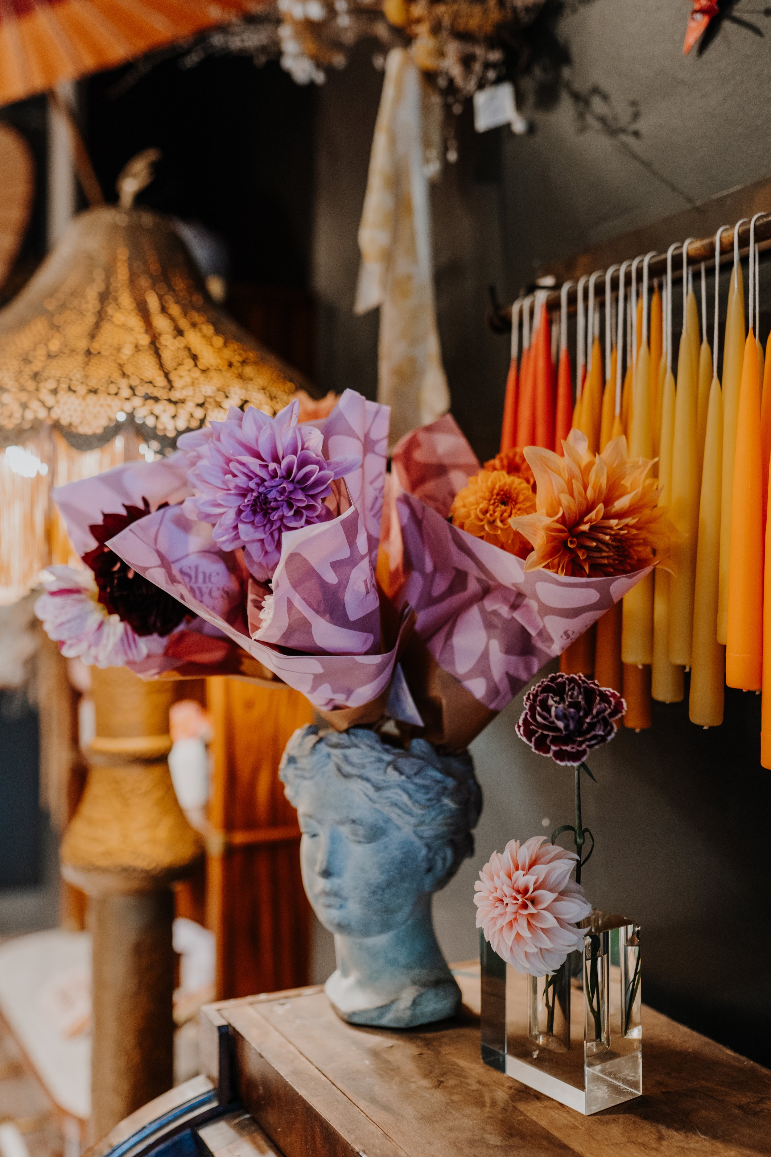
She Loves Me’s branding needed to be professional and trusting but also approachable so that their audience sensed the home-grown, kind-hearted, and cool-girl-next-door vibes. To keep things feeling bold and playful yet still classic, I incorporated elegant design details like ligatures on the primary logo and Matisse paper cut-out inspired illustrations. The female form and foliage illustrations by Holly May are a nod to the handmade aspect of SLM’s floral designs without being kitschy. One of the illustrated ladies embodies the game of “she loves me, she loves me not” where one plucks petals off a blossom until they have their answer and the other has an Alice in Wonderland quality about her as she cradles an oversized flower.

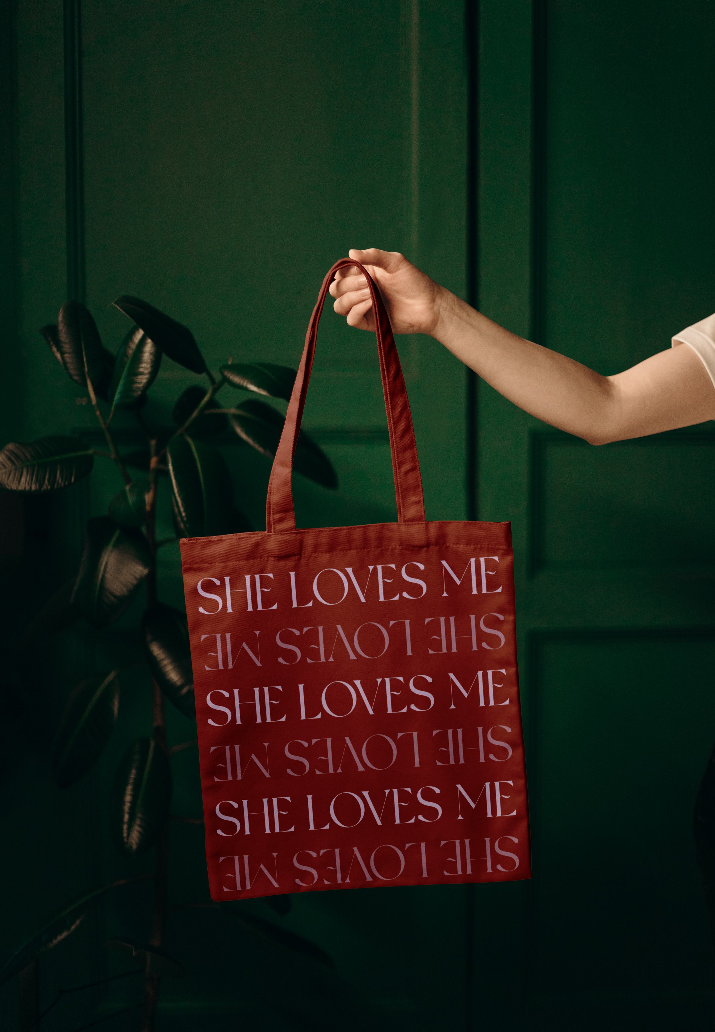


The typography for the brand features thick serif fonts that have calligraphy details paired with a modern transitional font for body copy and a chunky, hand-formed font influenced by Matisse’s cut-outs for taglines. The colorstory is luxuriously earthy with dark jewel tones and ethereal pastels as the core colors plus bright hues for pop- keeping their brand looking fresh, inviting, and polished. Teaching workshops is a large part of SLM’s business foundation so their brand voice had to build trust- but that didn’t mean puns were pruned. In fact, they were very much desired and my true literary talents were able to blossom as I planted puns throughout the website and printed goods.
All touch-points on the new website are considerate of the viewer and draw them into the floral-and-compliment-filled world that is She Loves Me. To help SLM stand out from the (flower) field of all beige and pink florist websites, I incorporated a midnight teal and aubergine along with rusty warm tones for background colors and moody, atmospheric photography throughout. The website’s coloring also now reflects the hues found within She Loves Me’s storefronts, creating a truly immersive brand experience.


creative direction, brand strategy, graphic design, web design
photography by Chelsea McCarty