
Precious Ghost Fine Jewelry
I studied Jewelry Design and Metalsmithing at the Academy of Art University and started my first business, Birds N Bones Jewelry, at twenty-one. Being able to do the brand identity, website, packaging, and editorial photoshoot for a woman-owned and operated fine jewelry company was truly the best opportunity to have all of my talents and abilities align and be utilized to help bring another maker’s dream to fruition.
Precious Ghost creates fine jewelry that is a discovery in new stones and styles, making the receiver feel special while using ethically sourced gemstones and business practices. Their pieces last for lifetimes- fitting symbolism for those who choose to make old bones together.
PLAYFUL LUXURY
MODERN
REFINED
ETHICALLY MADE
MYSTERIOUS
CLASSICALLY ROOTED
HIGH-LEVEL CRAFTSMANSHIP


Sarah Williamson came to Studio ZCC with a jewelry company that had little to no web presence but a strong following and community of loyal clients. Her designs are bespoke and truly original, but viewing her work or learning more about her company was primarily relegated to Instagram. Her DMs were where most of the communication for custom designs took place, which was not a sustainable way to operate her business. Sarah has been creating jewelry for over fifteen years and it was time for her to have a fully personalized, high-end, and professional brand design that encapsulated not just the beauty of her work, but also highlighted who she is as the maker of Precious Ghost Fine Jewelry.
We wanted her audience to immediately connect with her beautiful designs and also learn about the craftsmanship process, how the gems are ethically sourced, and her high-quality standards. By sharing more about Sarah’s process and what it’s like to work with her, we created holistic depth and engagement with her audience. Writer Hannah Piper Burns found Precious Ghost’s voice through interviewing Sarah and brought not only her biography to life, but also shaped the explanation of Precious Ghost’s semi-custom design process as well as crafted thoughtful and captivating product descriptions. The informative yet casual tone of the copy creates an approachable environment for people to connect with PG for collaborations and projects while still coming off as a company that provides luxury products.
A HANDCRAFTED IDENTITY
-

Packaging + Custom Illustrations
AN UNBOXING EXPERIENCE
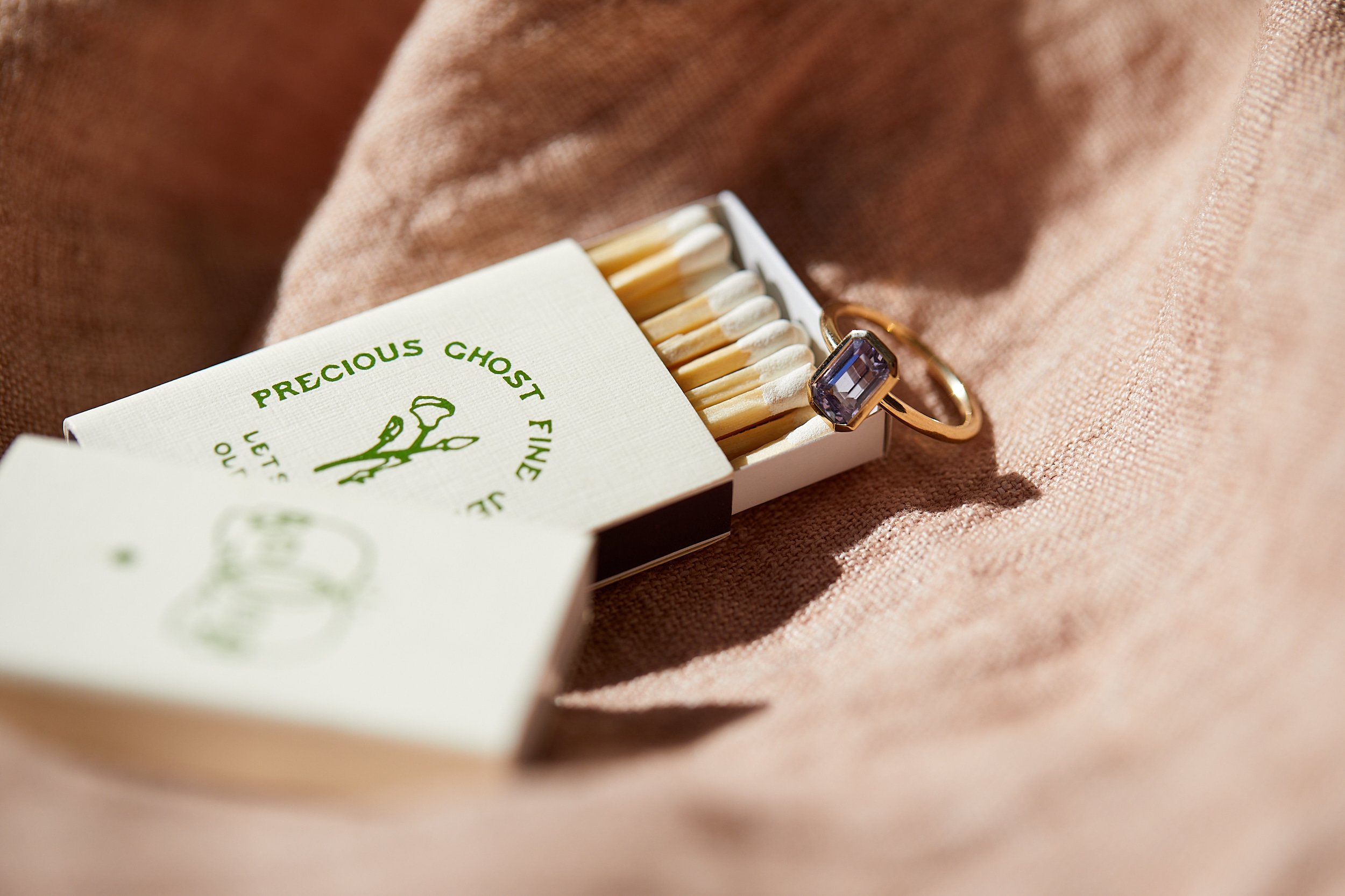
Thoughtfully designed packaging with intricate, custom illustrations that elevate the unboxing experience, embodying the brand’s ethereal beauty and mysterious allure.
-

Brand Design
VISUAL IDENTITY + MESSAGING
A sophisticated and timeless brand identity that highlights the artistry and elegance of Precious Ghost Jewelry, with a voice that sounds connective and trustworthy—curated for those who appreciate luxury with a modern edge.
-

Website Design
ONLINE PRESENCE
A high-end and seamless online experience that showcases the intricate details and craftsmanship of each piece, inviting customers to explore the collection with ease and intention.


The visual story for PG is refined, artisanal, and slightly ethereal- immediately drawing viewers into their world. The branding is an homage to how their designs are modern and slightly wild, yet rooted in classic technique. Style is innate and the color palette brings in a 70’s day-dreamy earthiness while remaining contemporary with the use of an anchoring dark background. There’s a mix of graphic serif headers and sans-serif detail copy to keep things accessible and legible (but still cool AF). Their Primary word-mark logo is bespoke and sophisticated with a modern boldness thanks to the semi-calligraphic main typeface. The typography suite also incorporates a stylized handwritten font for taglines and printed collateral to bring in the desert vibes that run as an undercurrent to the overall branding aesthetic.
To set them apart from the branding of other high-end jewelry designers, we curated custom illustrations from Bristol-based illustrator, Holly May. These graphics help bridge the visual gap between Precious Ghost’s word-mark logo and their handmade jewelry designs and are a way for them to show their inspirations, such as California wildlife, in a refined way.
CUSTOM CURATION


Zoe helped Precious Ghost find its voice through her logo and branding work. She busted her ass putting together the new website and I do not possess the vocabulary for how much I enjoyed working with her and how impressed I am with the quality of work she did. She is the third creative agency I’ve hired to do this work and this time I finally got what I wanted and feel like I won the lottery.
— Sarah Williamson, Owner + Lead Designer
creative direction, brand strategy, graphic design, packaging design, web design, styling
photography by Aubrey Janelle and Alyssa Keys