


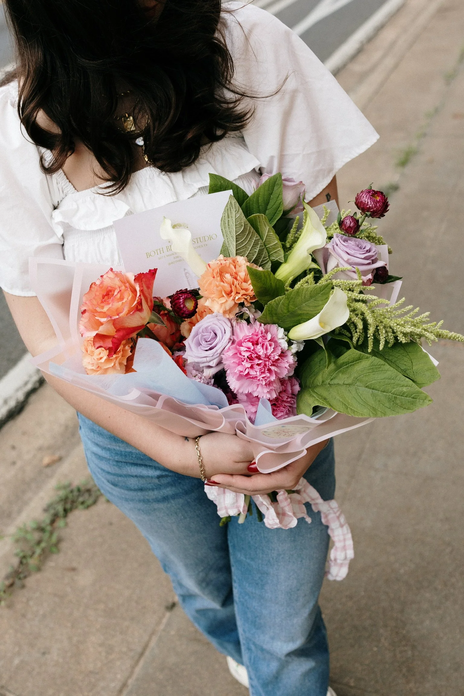
Both Bloom Studio
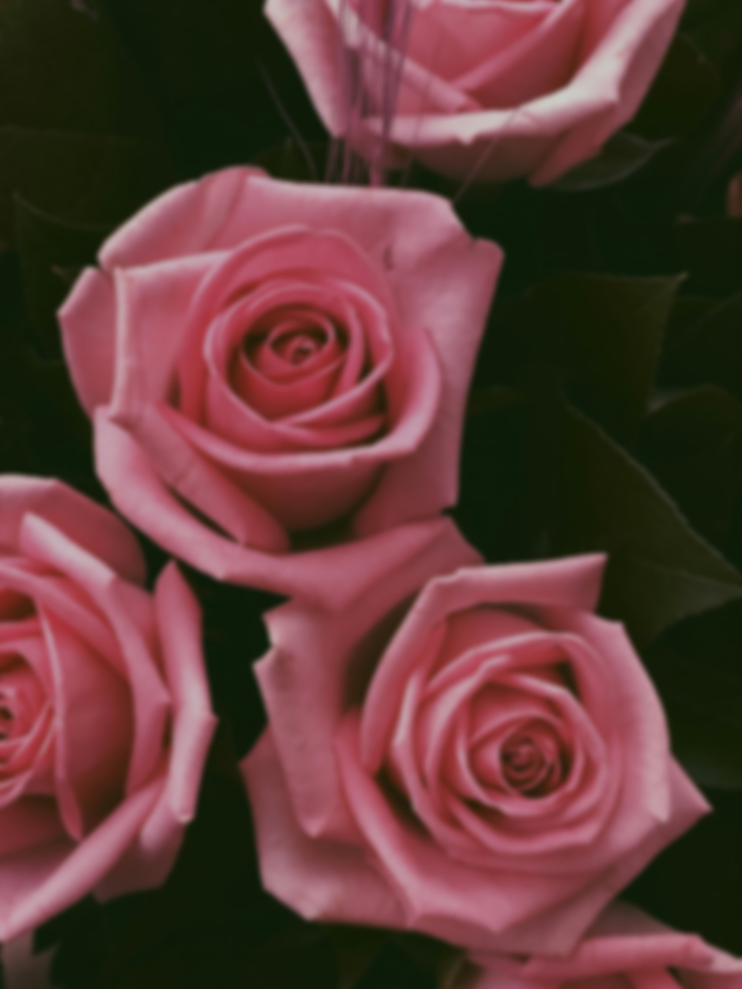
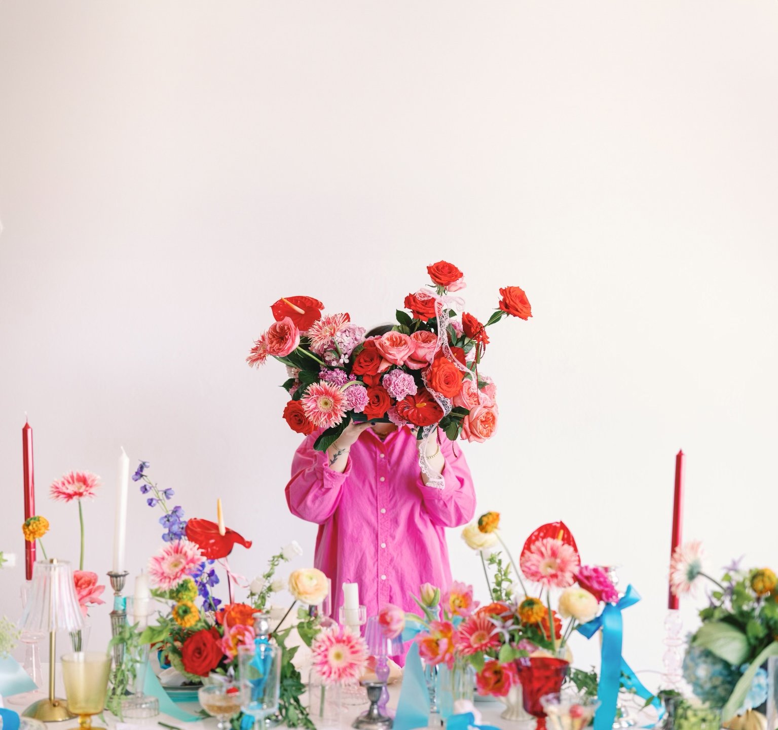
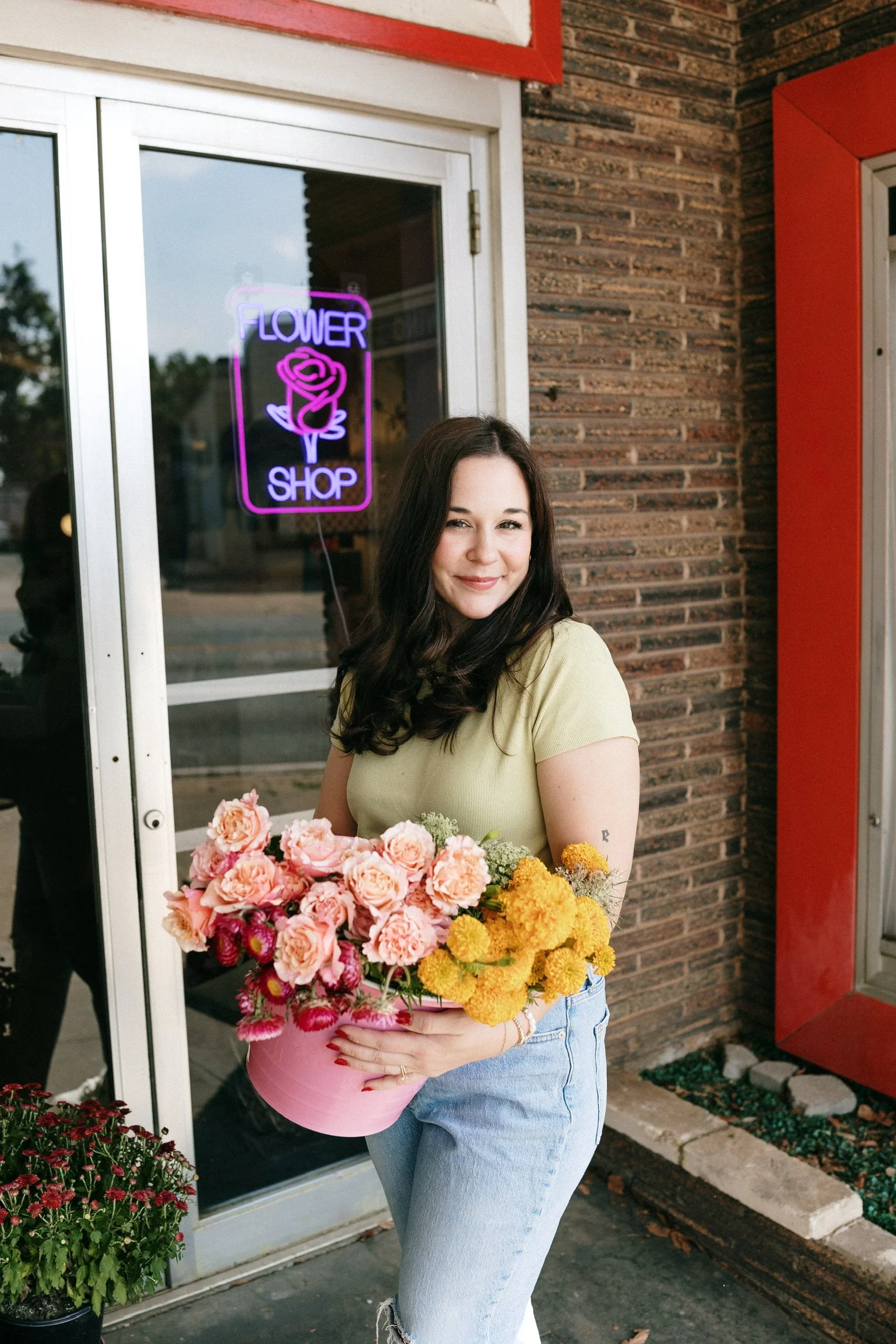
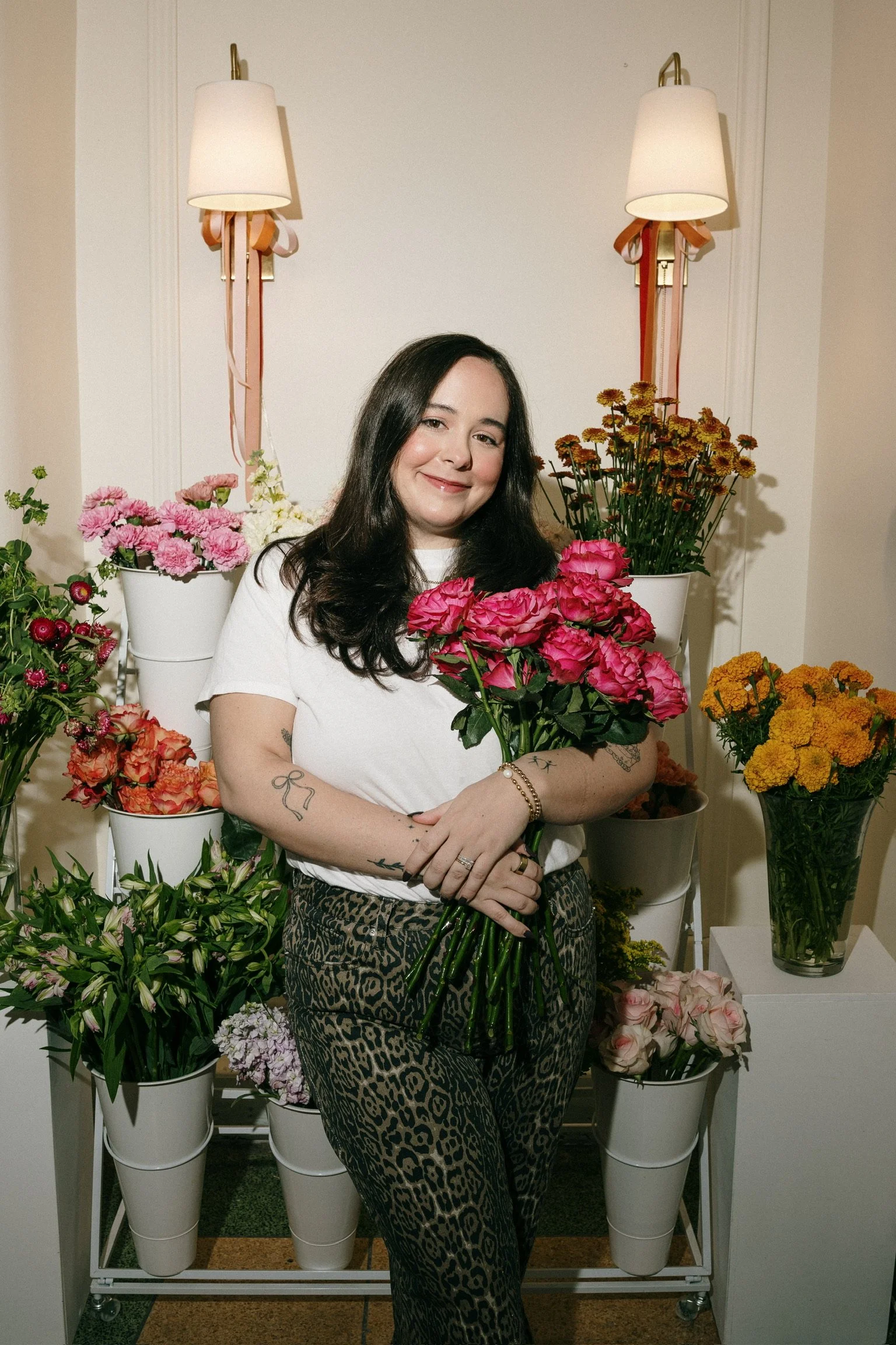
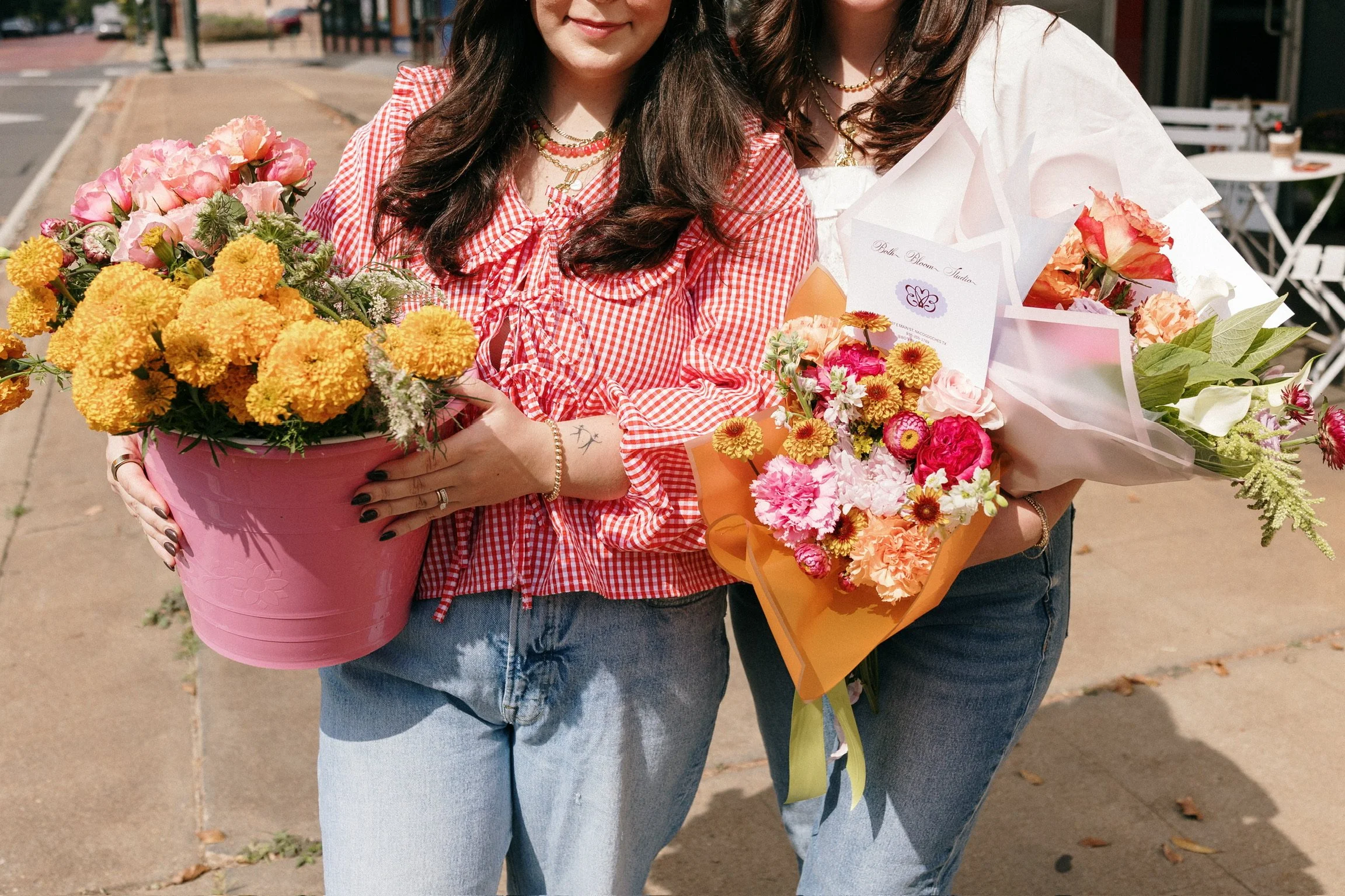
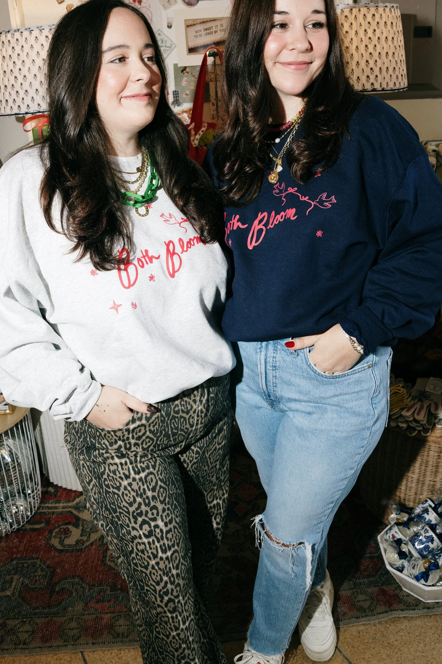
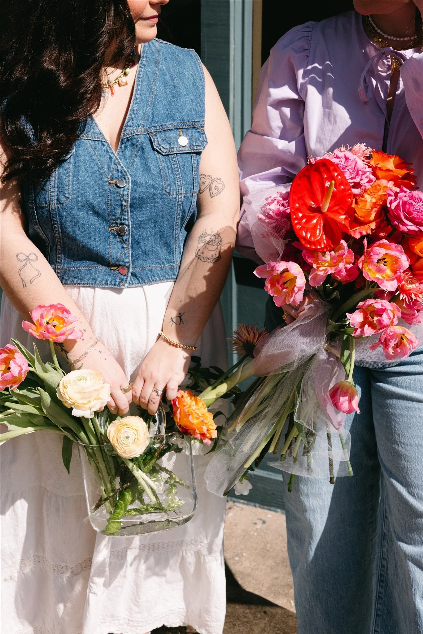
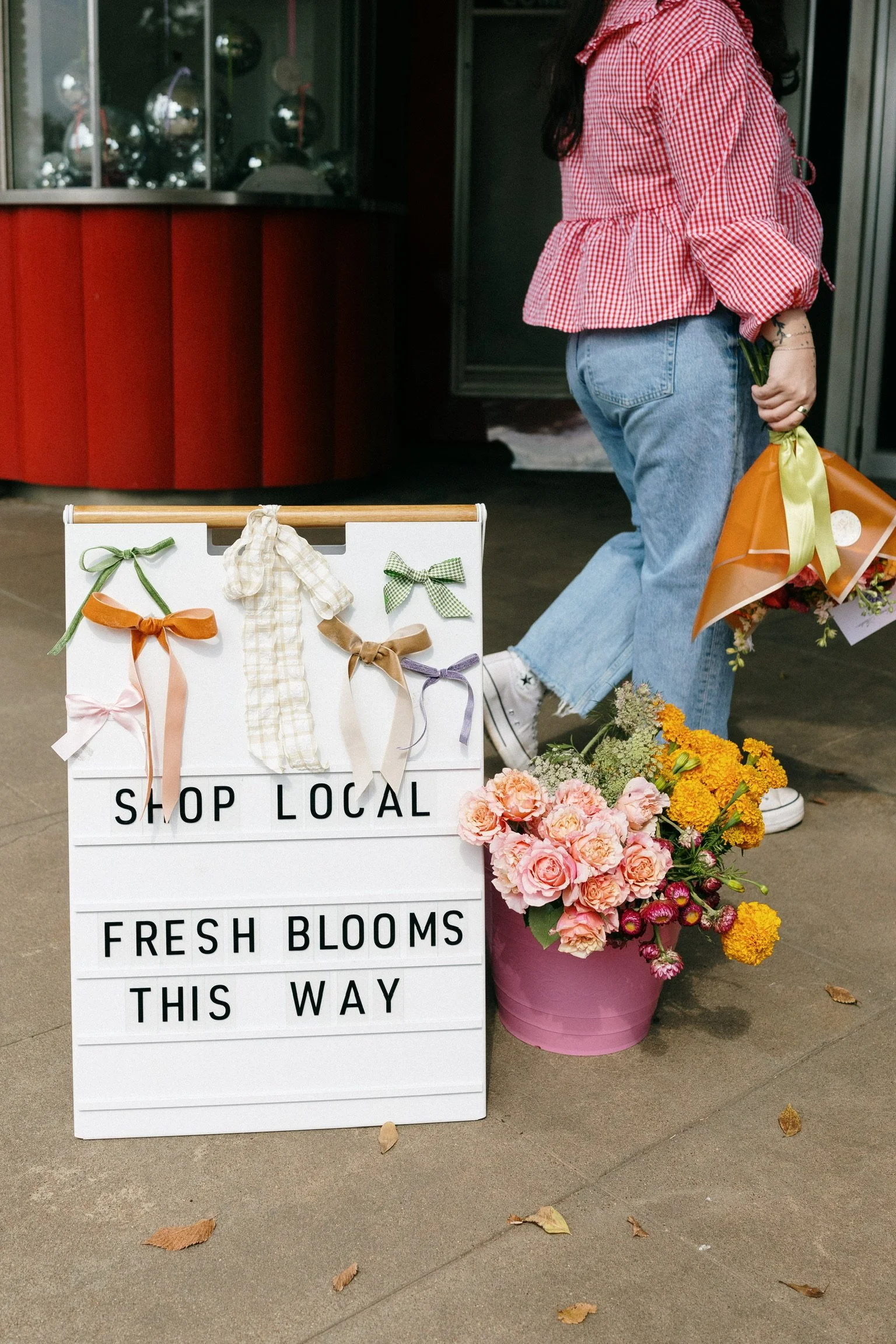
Big changes blossomed at Both Bloom Studio, as it transformed from the solo venture of Hannah Willis Creative to a vibrant collaboration between Hannah and her twin sister, Sarah. This evolution into their own entity stands as a testament to innovation, resilience, and the power of familial collaboration within the floral design world. Both Bloom is more than just a business; it’s a living testament to dreaming boldly, embracing change, and creating beauty together. As Hannah + Sarah work, they set an inspiring example for the next generation in their family, who watch and learn from their playful corners of the studio. Both Bloom’s branding weaves together the ornate and the organic, celebrating the studio’s handcrafted approach to floral design.
JOYFUL
PASSIONATE
COABORATIVE
PLAYFUL
FRIENDLY
SOPHISTICATED
TRUSTWORTHY


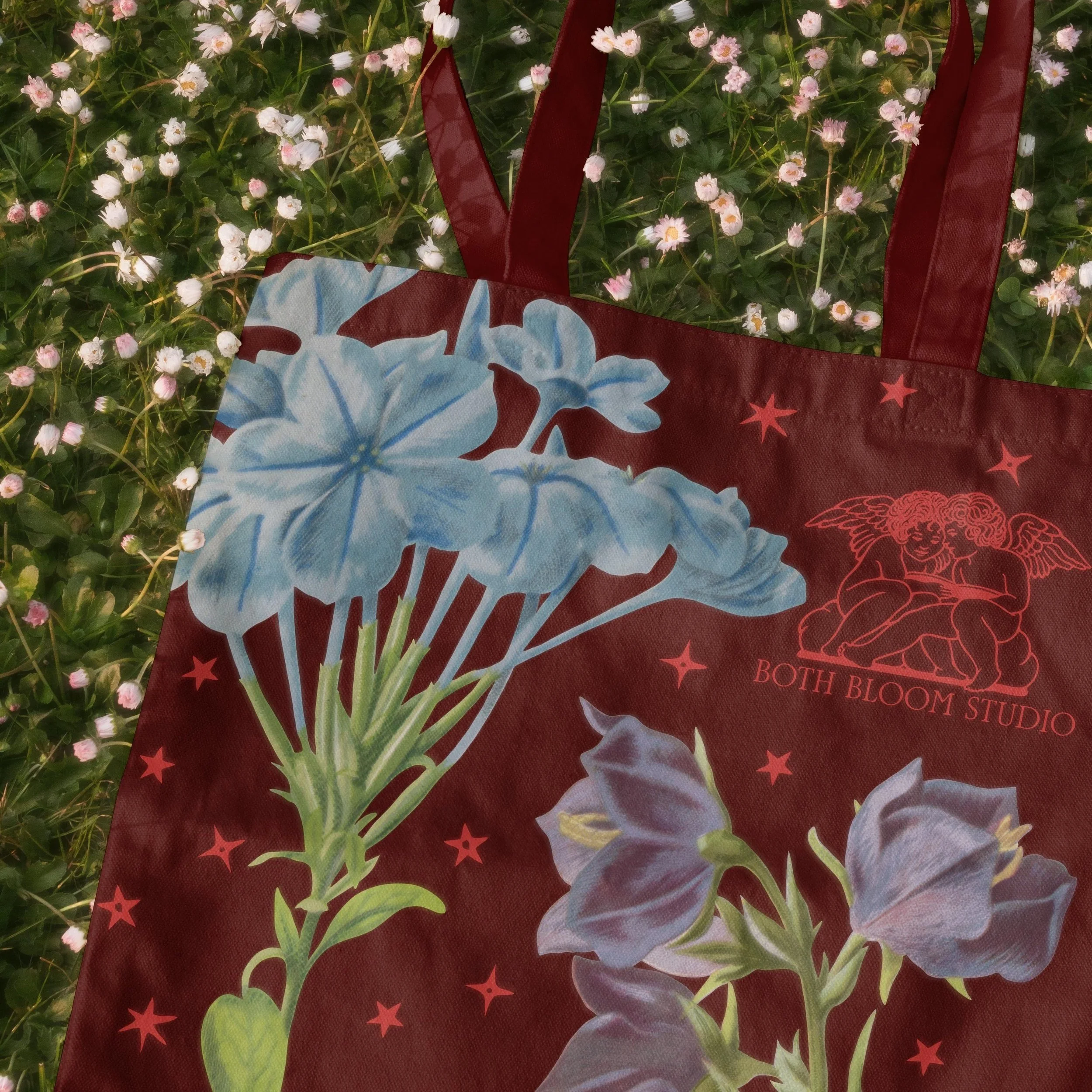
Maria Scott’s custom illustrations seamlessly blend Both Bloom Studio's distinct dual heritage, merging coquette girl charm with eclectic grandma wisdom into a visual narrative. This fusion creates a compelling visual narrative that appeals to a discerning clientele and sets a cornerstone for the brand’s identity. The illustrations combines old-world elegance and modern vibrancy which allows Both Bloom to convey its unique story in a visually rich and expressive way. In a marketplace where distinctiveness is key, these illustrations serve as Both Bloom’s signature to ensure the brand stands out with its sophisticated mix of tradition and freshness.
IMAGINATIVE ILLUSTRATIONS
-
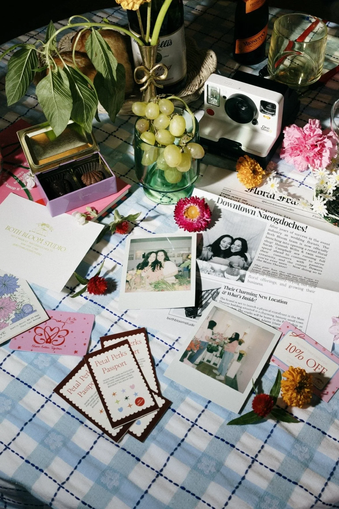
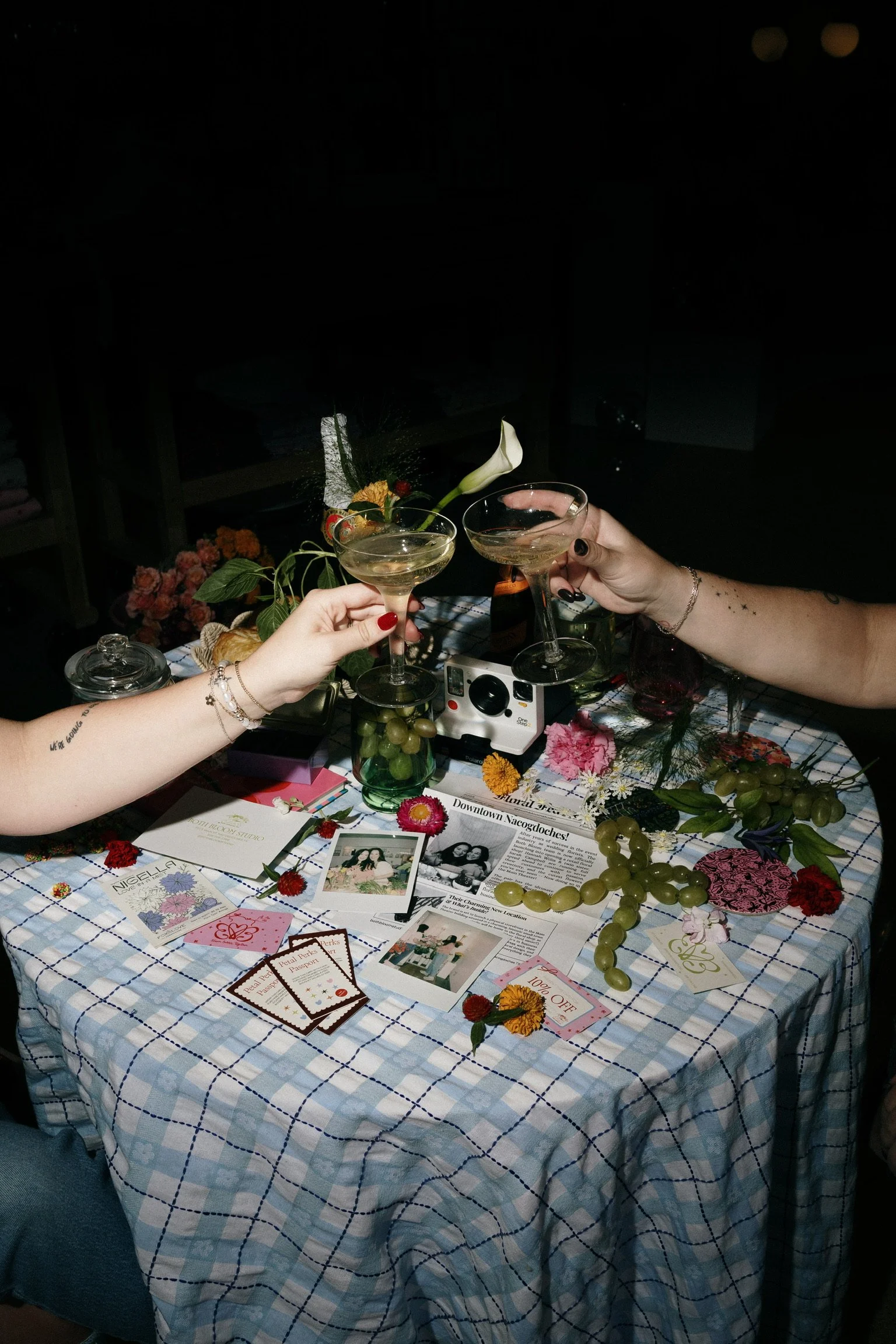
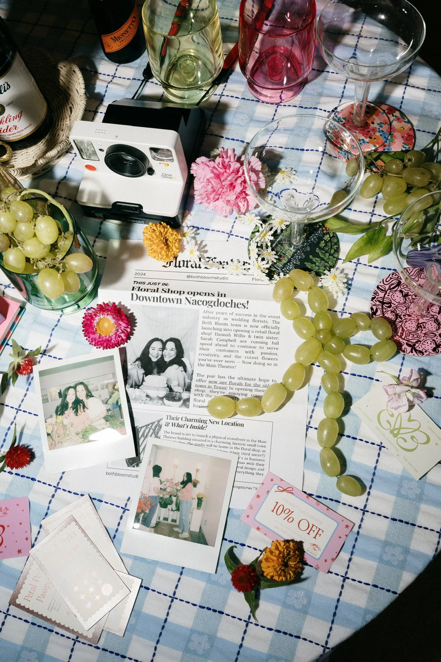
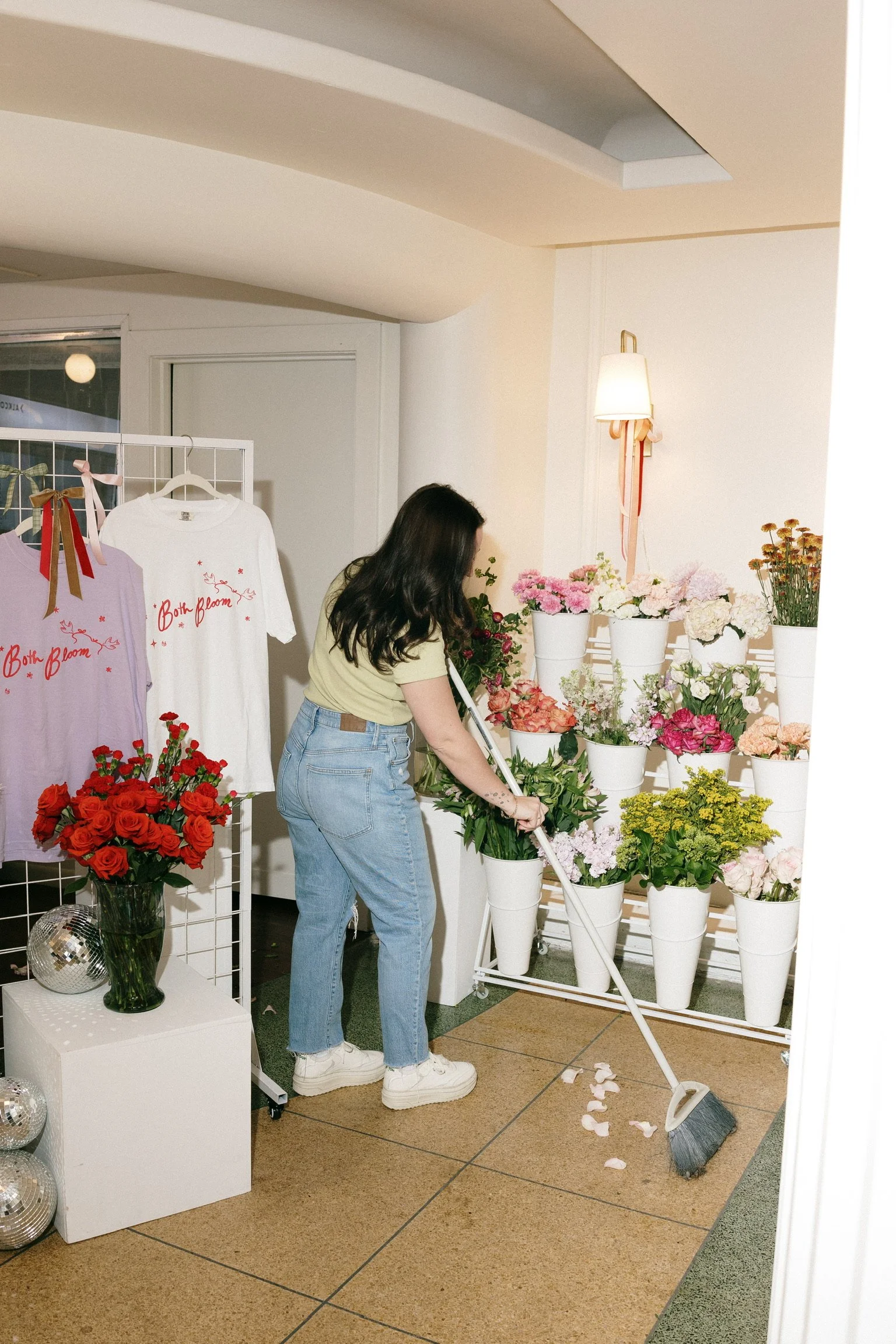
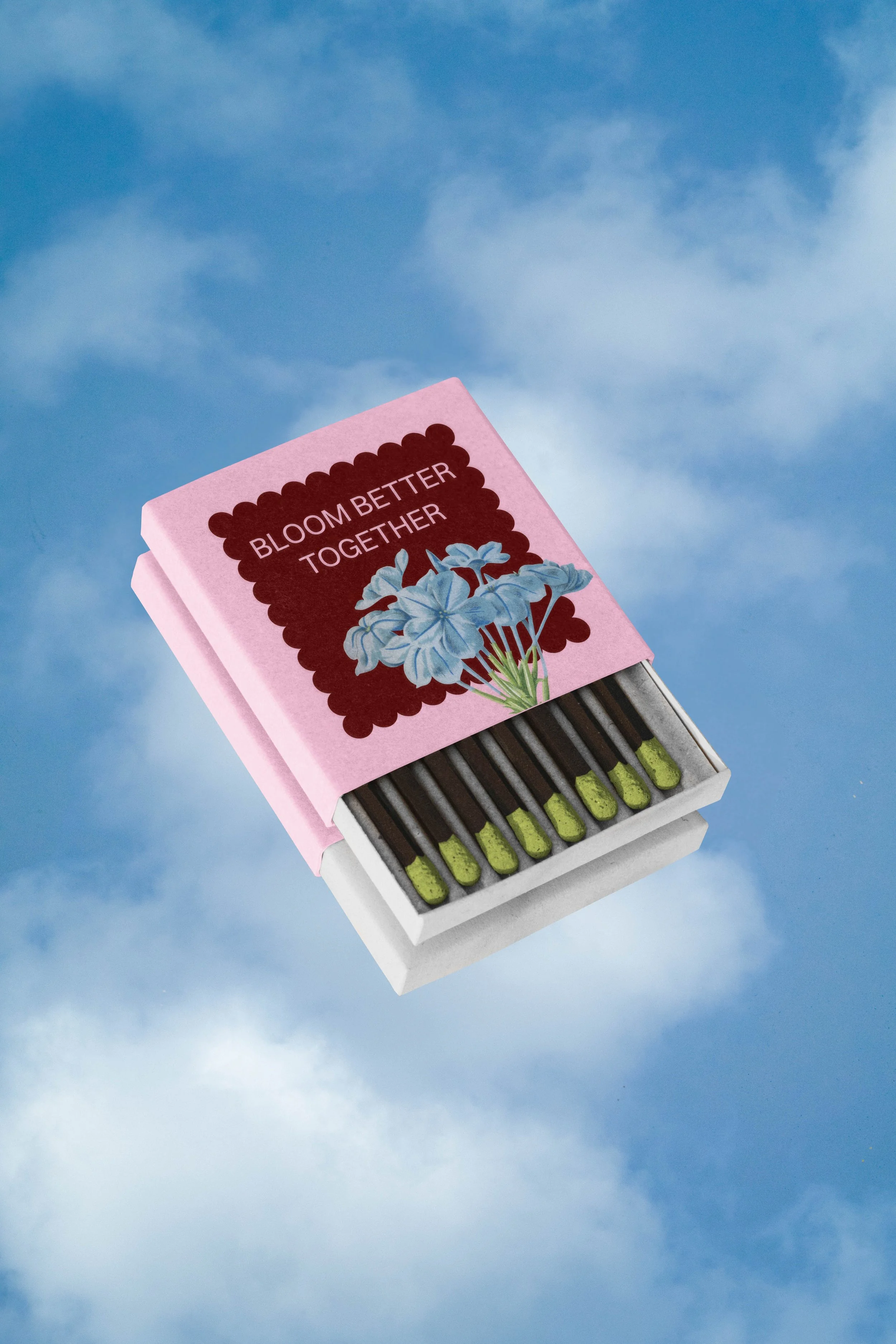
Printed Goods
TAKEAWAY TREASURES
The printed goods are a playful and tangible extension of the brand’s personality. Each piece is designed to feel like a little keepsake, blending functionality with the studio’s distinctive charm.
-
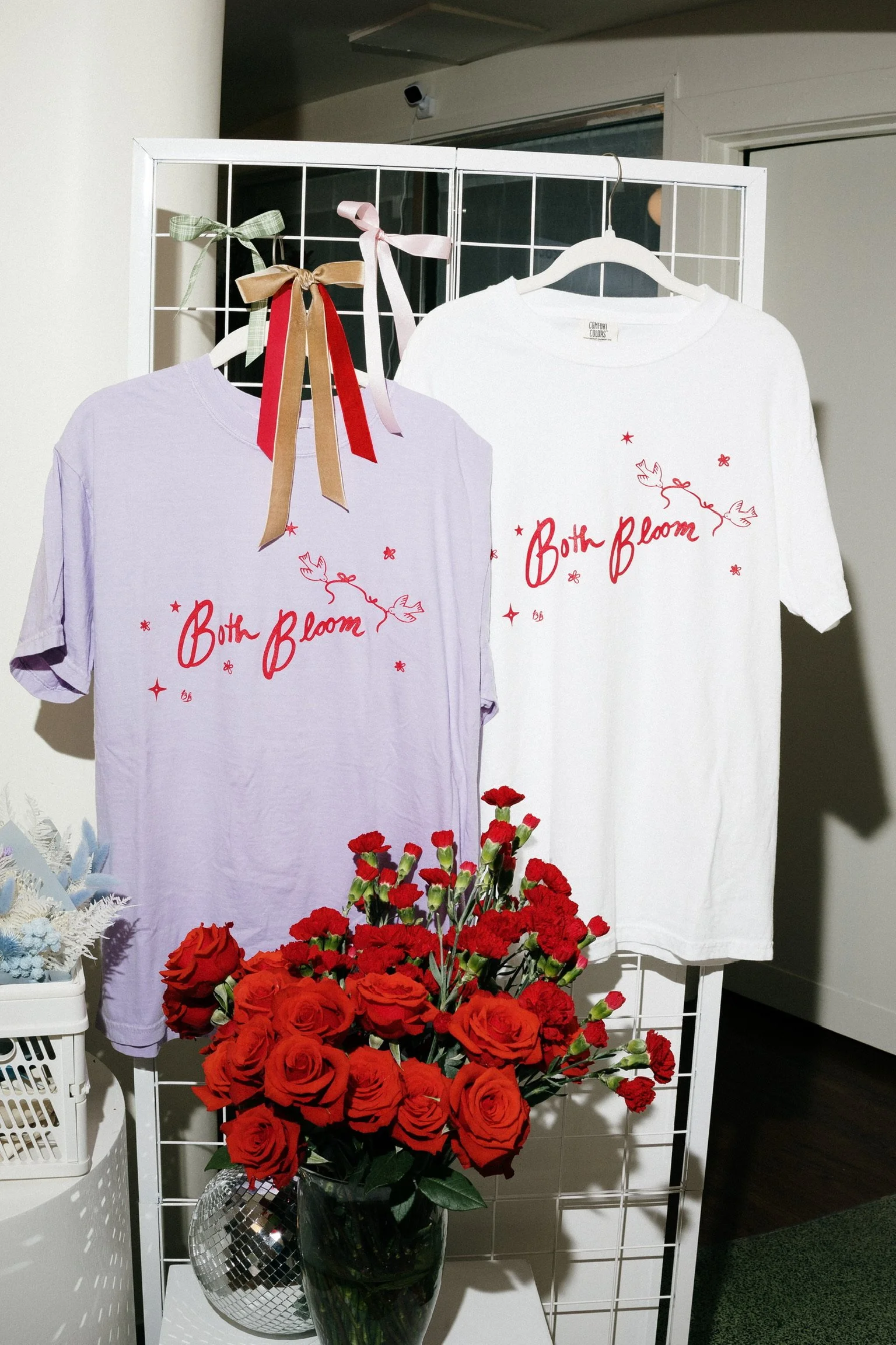
Merch Design
CREATIVE COLLECTIBLES
Both Bloom Studio’s merchandise offers a fun and stylish way for fans to show their support. Designed with a playful twist, each item reflects the studio’s vibrant personality and sense of creativity.
-
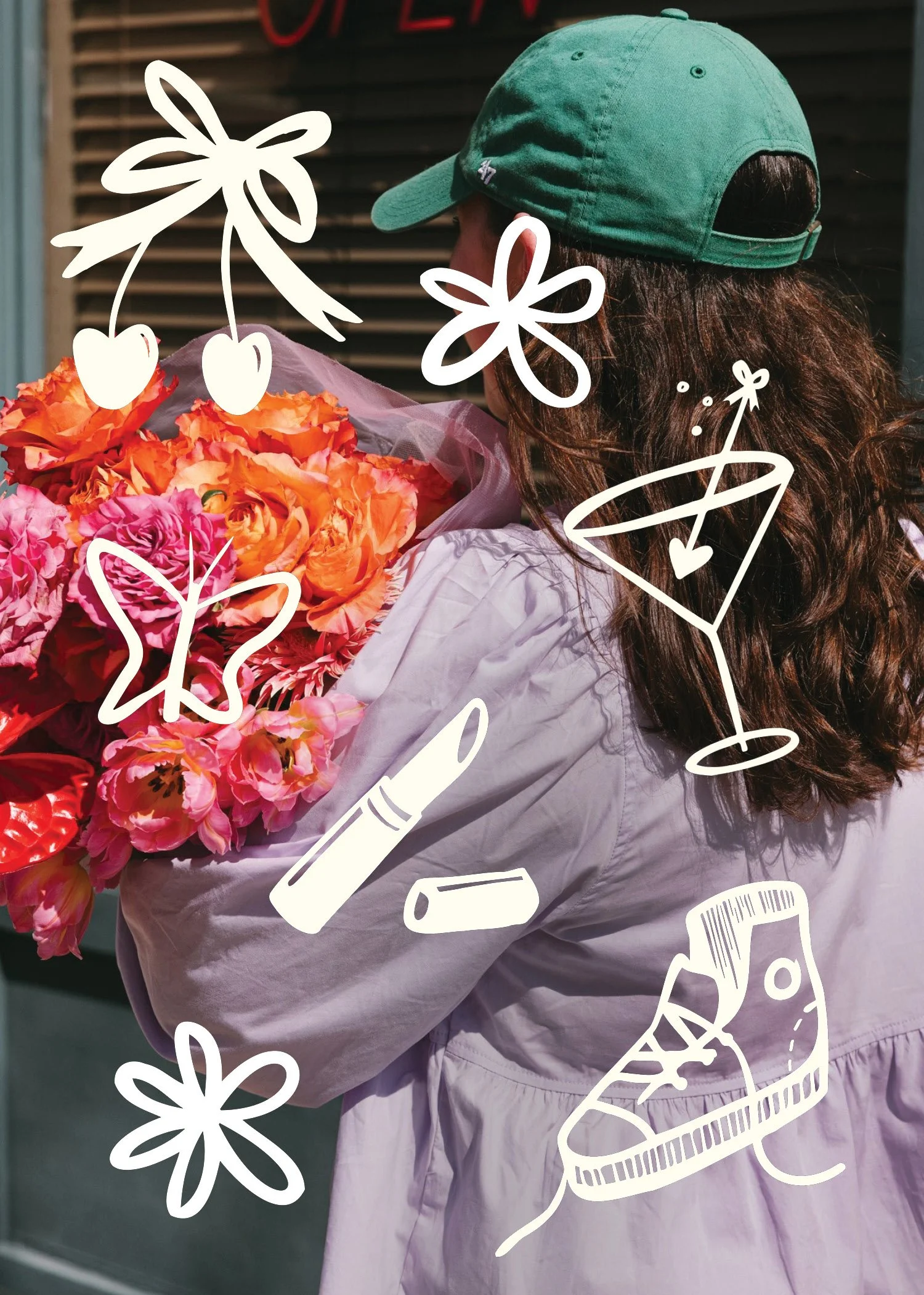
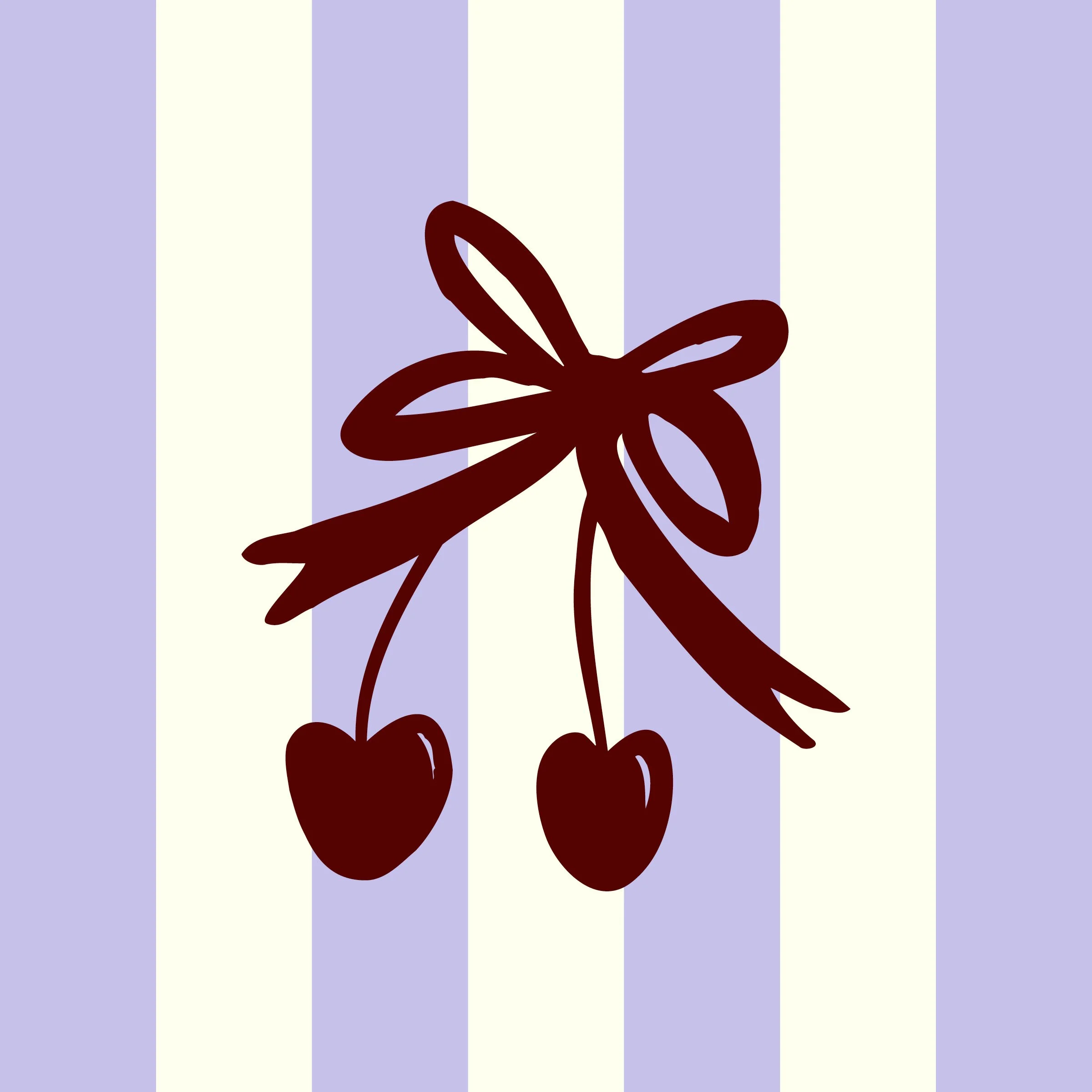
Custom Illustrations
COQUETTE CHARM
These bespoke designs combine delicate charm with bold creativity, capturing the studio’s essence in every detail. Infused with a mix of timeless elegance and modern energy, the illustrations create a visual story that sets Both Bloom apart.


The logo suite for Both Bloom Studio elegantly encapsulates the brand's versatility, from the artisanal flair of a script typeface to the balanced sophistication of mixed fonts and the bold statement of a serif in uppercase. Each logo variation resonates with a different facet of the studio’s identity, artisanal charm, personalized service, and timeless strength, allowing the brand to adapt and connect with various audiences and settings seamlessly. This thoughtful curation ensures that Both Bloom's visual identity remains cohesive yet dynamic, perfectly tailored to reflect the studio’s blend of tradition and modern elegance.
With a flourish of creativity and a dash of charm, Both Bloom's refreshed branding captures the essence of a studio where every petal and stem tells a story. Infused with whimsical illustrations and a diverse logo suite, the new branding is a vibrant celebration of Both Bloom's passion for bringing people together through the art of floristry. As the studio looks forward to a future filled with growth and blooming possibilities, its branding stands as a beacon of creativity; a reflection of a brand that’s rooted in joy and ready to branch out in bold, new directions.
BUILDING A BRAND WORLD


It honestly feels like Zoe knows our business better than we do. It all gets SO muddled, which is why we wanted to hire someone like Zoe in the first place. It can be so hard to think intentionally or even strategically about our brand most days ~ when we’re in the throes of babies at work, brides in our inboxes, and everything in between. This branding process feels valuable and truly priceless; it really aligned us with our mission and allowed us to create space for clarity with future employees and, of course, future/current clients as well. We’re obsessed with Zoe and obsessed with all of the branding she created for us. It has us SO GIDDY!
— Hannah + Sarah, Co-Owners
creative direction, brand strategy, graphic design
Photography by Marquel Patton + Elena Rubtsoova